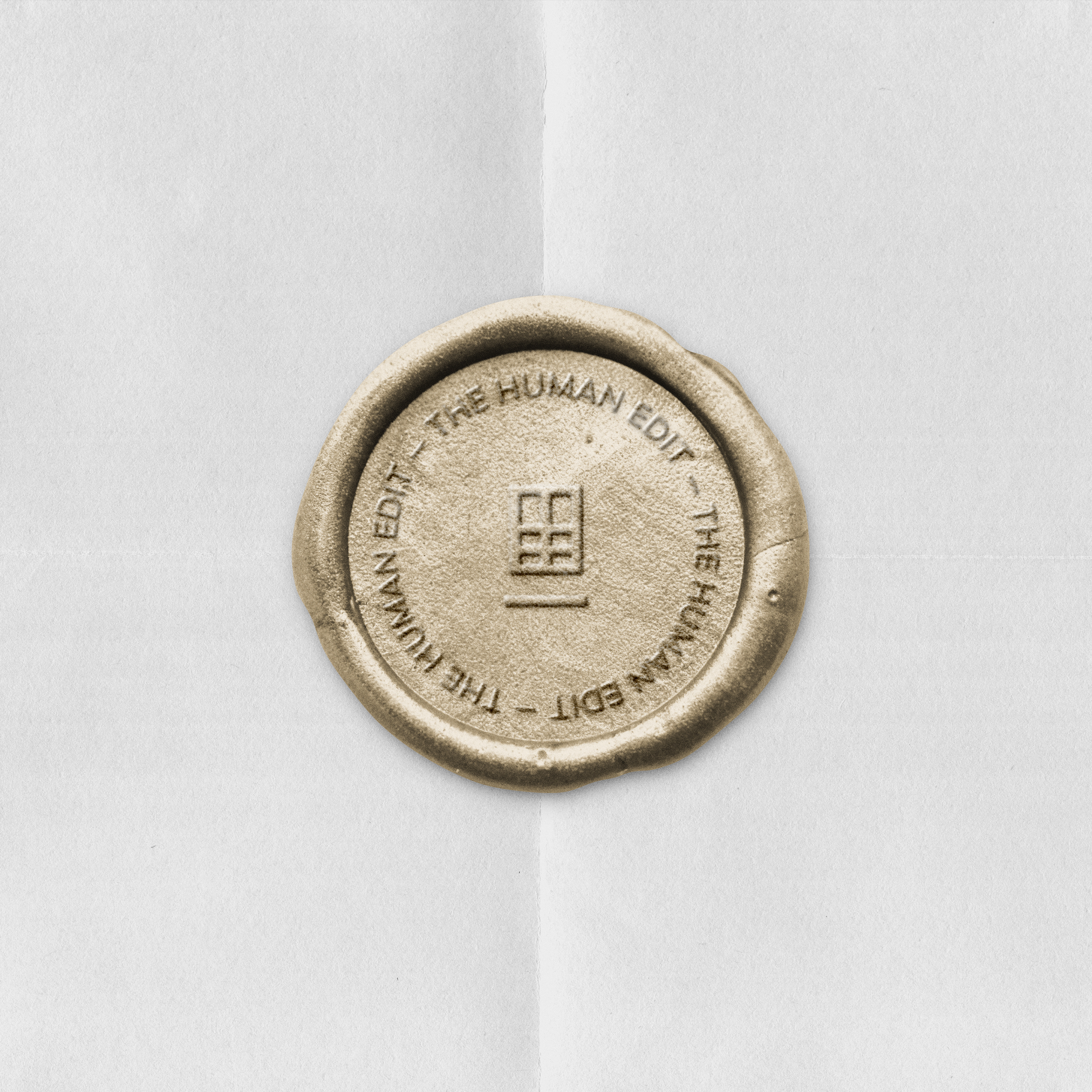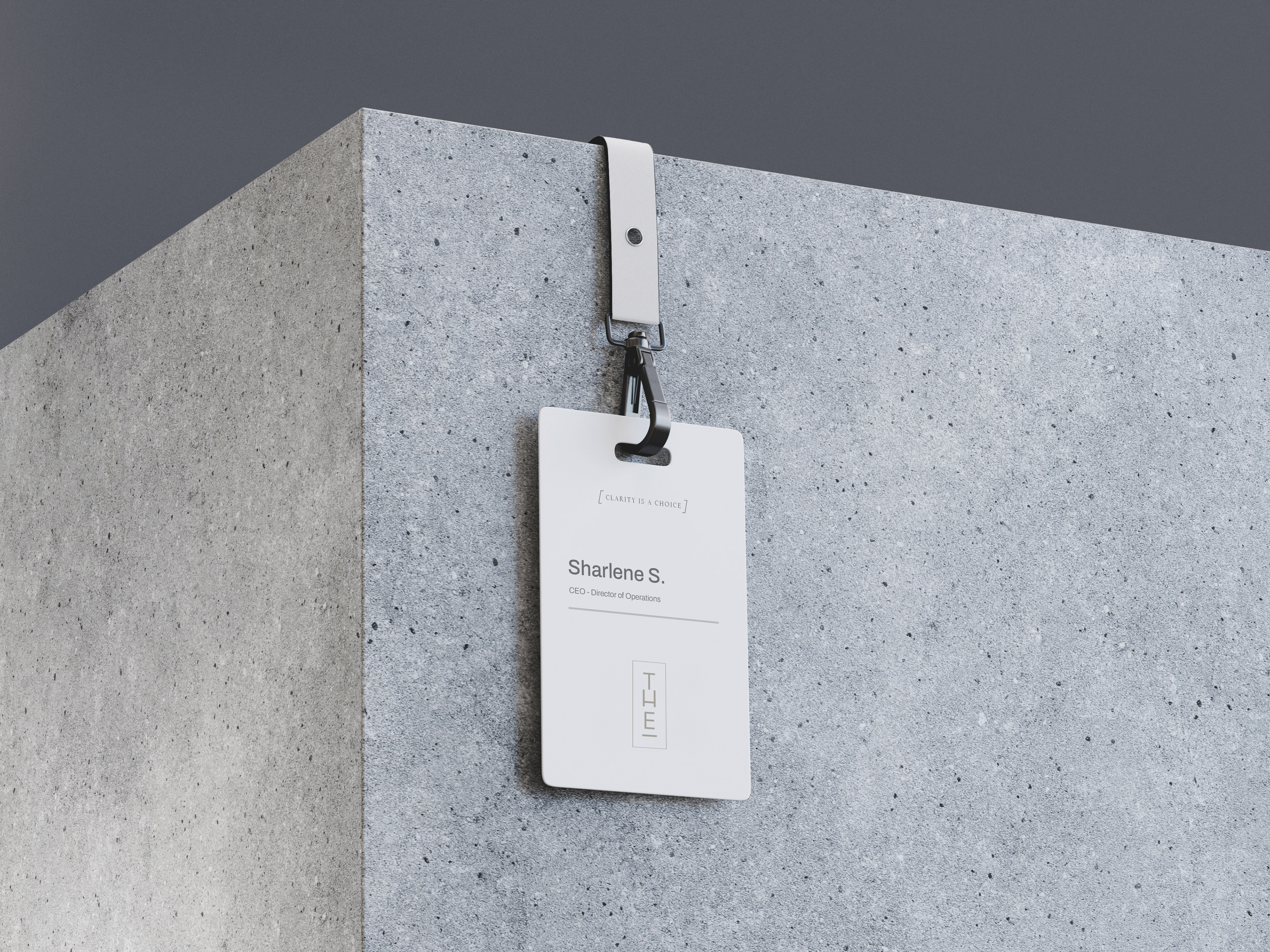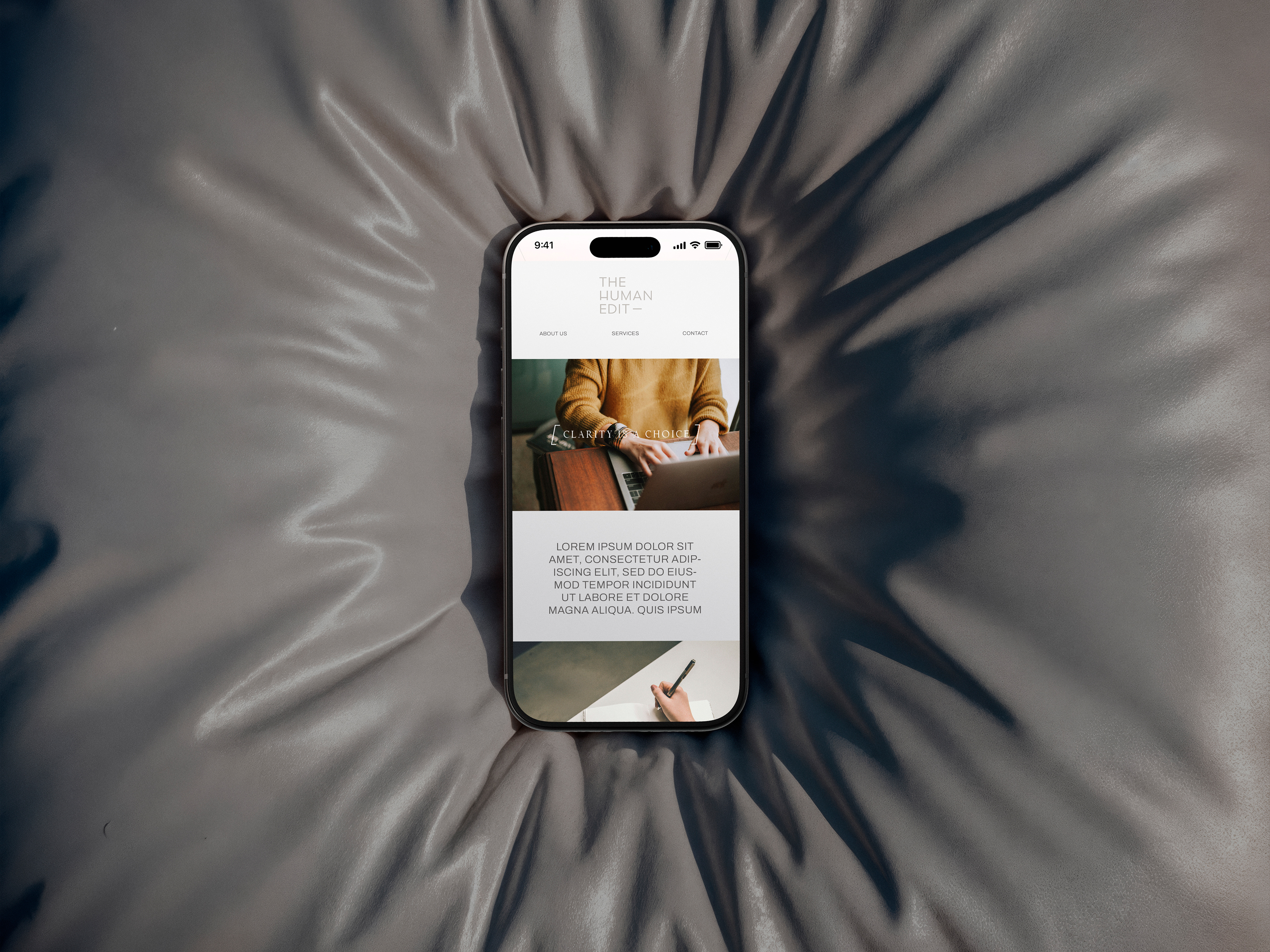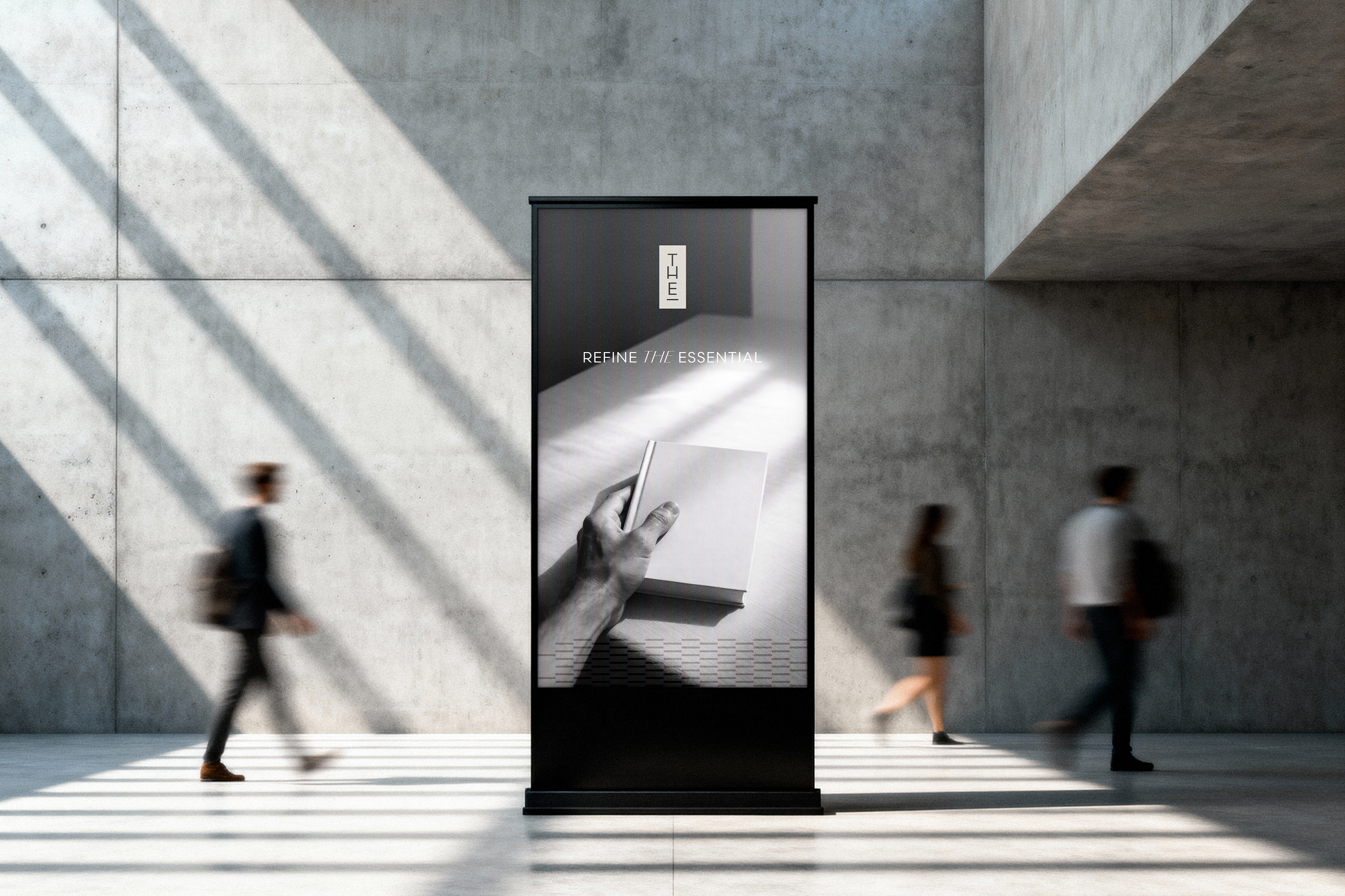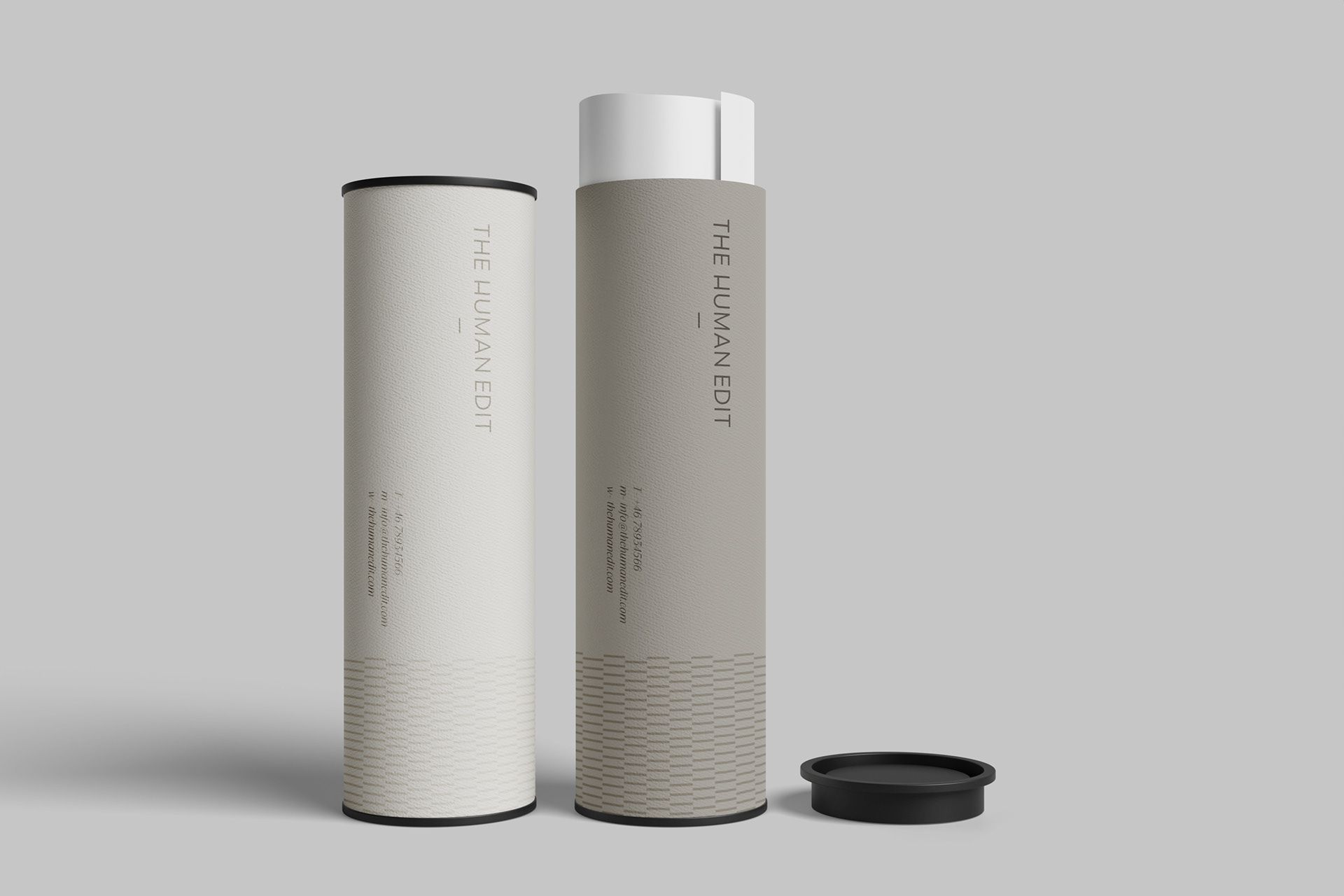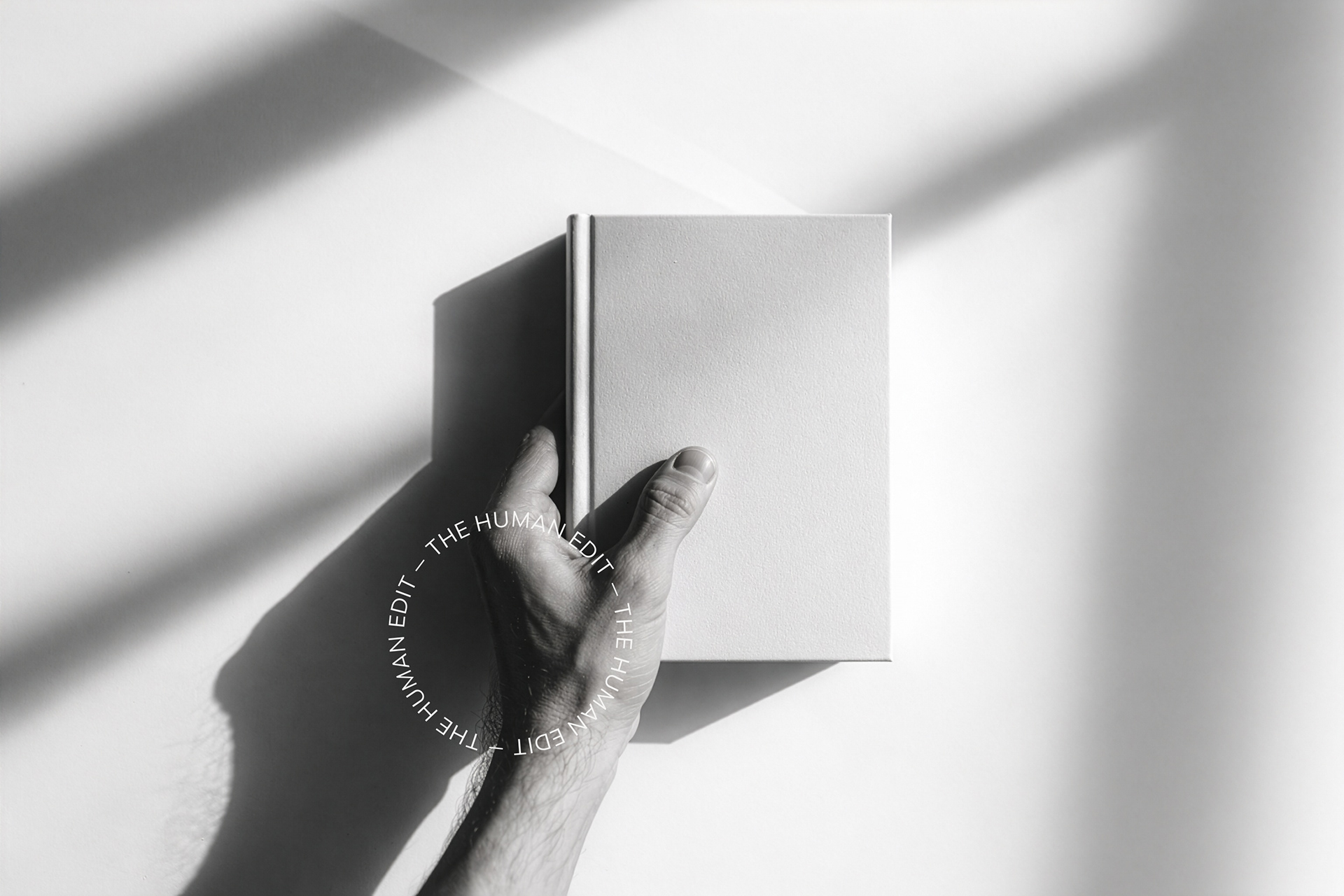
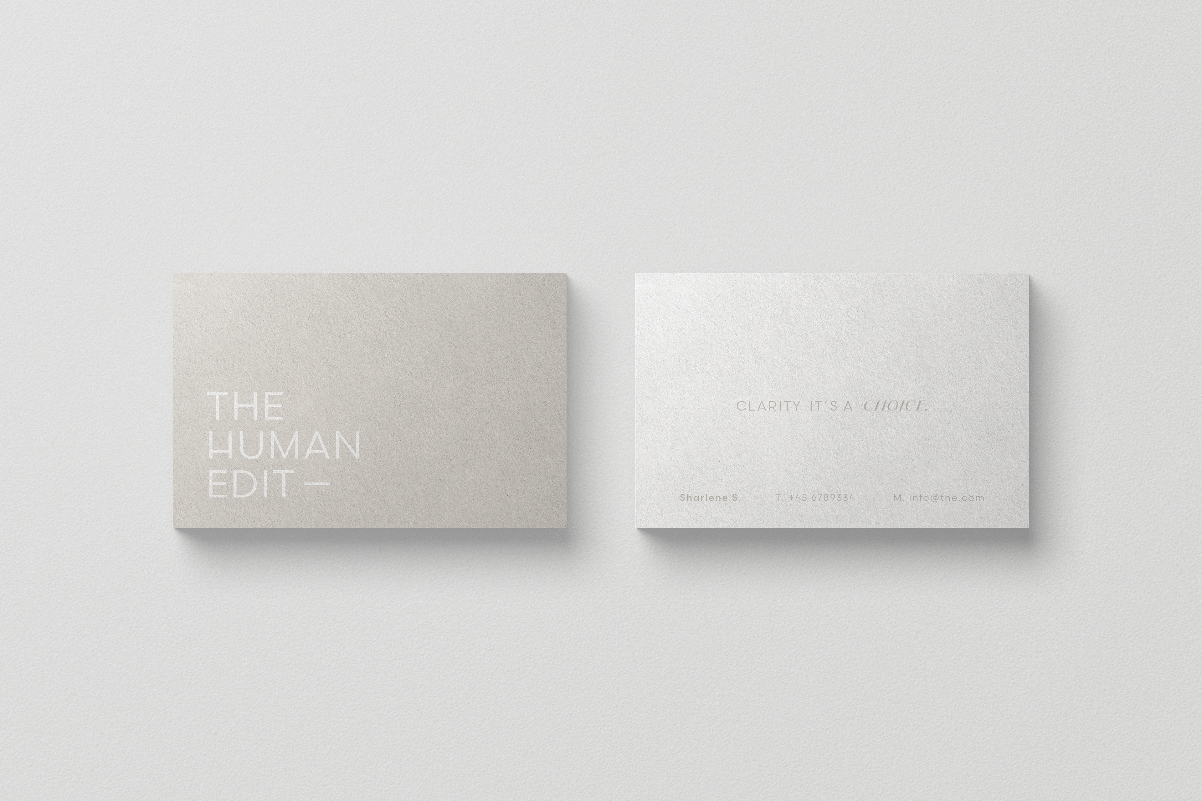
For The Human Edit, we developed a foundational brand system built on clarity, restraint, and intentional decision-making. The identity was conceived as a structural framework rather than a decorative one—designed to reduce noise and create space for thoughtful, human-centered work.
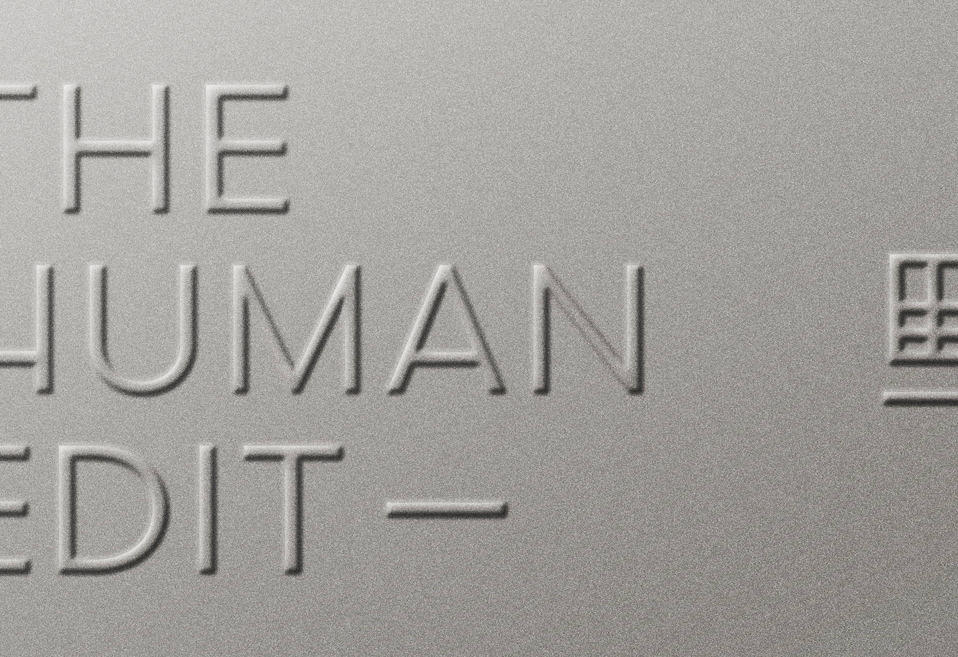
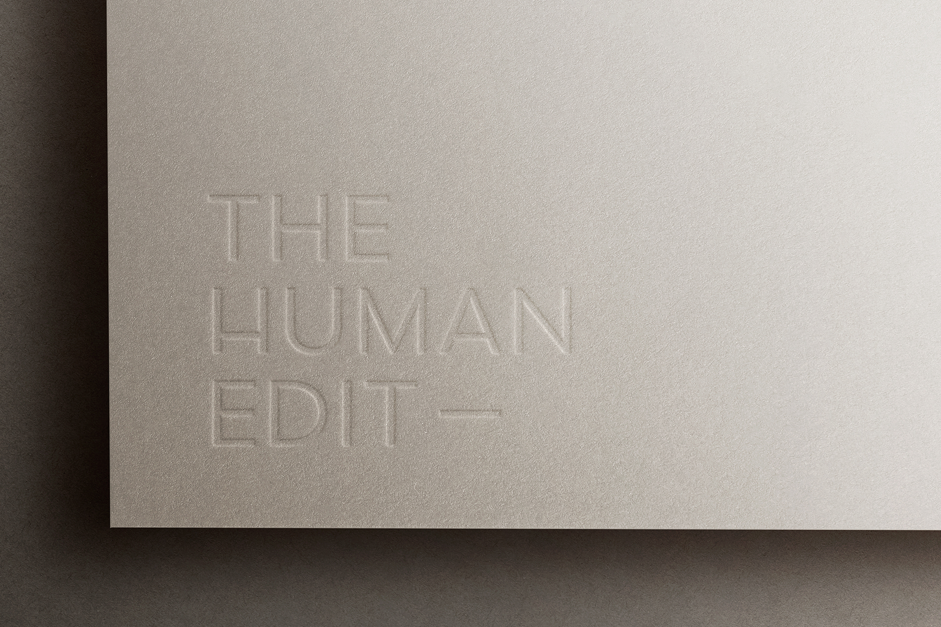
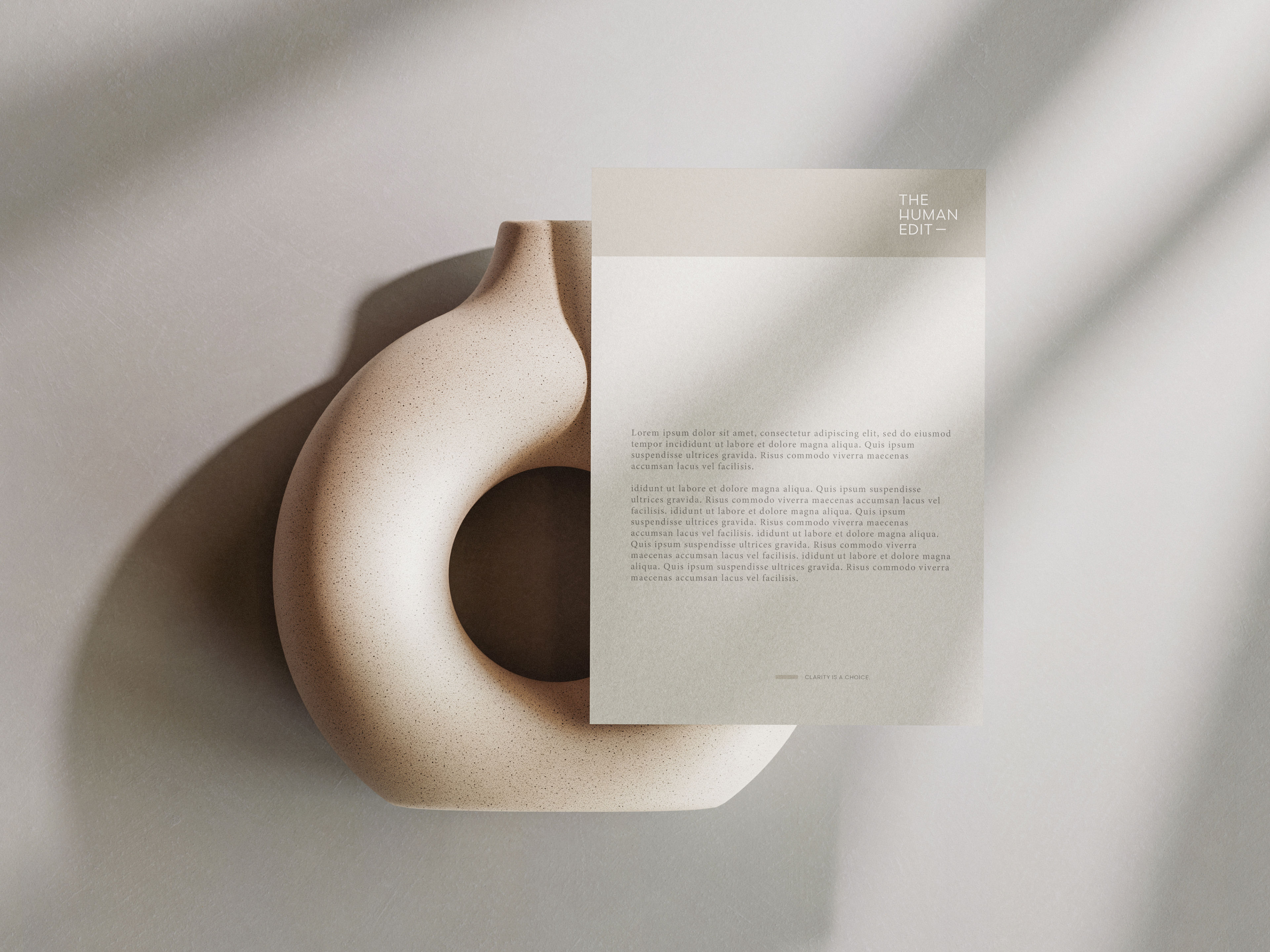
We created a balanced typographic logo system, using a stacked wordmark and an editorial em dash as a gesture of pause, connection, and discernment. The visual language prioritizes calm presence over dominance, reinforcing collaboration and intellectual rigor.
The system is supported by a quiet, neutral color palette and an editorial typography structure that emphasizes readability, rhythm, and reflection. Clear usage rules, compositional principles, and institutional patterns ensure consistency across decks, documents, and cultural contexts.
The result is a durable, clarity-first identity that feels considered, grounded, and quietly confident—designed to support meaningful work over time.